
How to Wear Monochrome Outfits: Build Depth in 2026
 Abdul WadoodLast updated

Monochrome dressing has a reputation problem. People hear “one color from head to toe” and picture a single flat block of fabric, more uniform than outfit. In practice, the opposite is true: some of the most photographed looks in fashion history rely on a single hue, and they work because of small, deliberate choices rather than luck. The trick is understanding that monochrome is not about matching. It is about layering tone, texture, and proportion inside one color family so the eye has somewhere to travel.
This guide breaks down how monochrome outfits actually come together: how to pick a color, how to build contrast without breaking the palette, where people go wrong, and how to adapt the approach to different body types, seasons, and budgets. No rigid rules, just the mechanics that separate a sharp tonal look from a forgettable one.
Why Monochrome Works in the First Place
A single-hue outfit does something useful for the viewer’s eye: it creates an unbroken vertical line. That continuous column of color reads as height and length, which is why stylists often reach for tonal dressing when they want a lean, polished silhouette. It also removes the hardest decision in getting dressed, which is color coordination. Once the palette is locked, every other choice becomes about fit and fabric.
There is a practical side too. Monochrome wardrobes are easier to shop for and easier to combine. If most of a closet sits in two or three color families, nearly everything pairs with everything else. That is why capsule wardrobes so often lean tonal. The constraint is the feature.
The catch is that a single hue with zero variation looks less like a choice and more like a uniform. Depth is the whole game.
Step One: Choose the Right Base Color
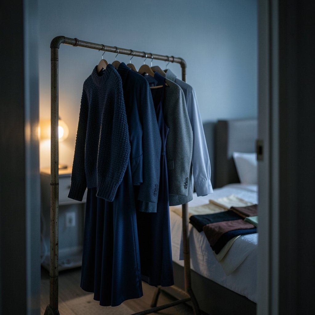
Not every color behaves the same way in a head-to-toe look. Before building an outfit, it helps to think about how a hue responds to light, to the wearer’s skin tone, and to the setting.
| Color family | What it does well | Watch out for |
|---|---|---|
| Black | Slims, hides creases, works for evening | Can flatten detail; texture becomes essential |
| White and cream | Reads fresh and expensive; strong in daylight | Shows wrinkles and stains; needs tonal layering |
| Navy | Softer than black, flattering on most skin tones | Cheap fabrics look flat in low light |
| Brown and tan | Warm, approachable, great for knitwear | Can wash out pale skin without contrast near the face |
| Gray | Neutral, easy to layer in three tones | Mid-gray head-to-toe can look corporate |
| Bold hues (red, green, blue) | Memorable, high impact | Harder to source in multiple tones |
For a first monochrome outfit, neutral bases are forgiving. Black, navy, cream, and brown all come in enough shades and textures that building depth is straightforward. Bold colors are worth trying once the mechanics feel natural. A saturated blue, for instance, is one of the more wearable statement palettes, and the same principles of tone and texture apply. Anyone leaning toward a bolder direction can study how blue hair dye works and how to keep the shade looking rich for a reminder that color maintenance matters as much as color choice.
Match the Color to Skin Tone, Not to Trends
A common mistake is choosing a monochrome color because it looks good on someone else. The better test is simple: hold the fabric near the face in natural light. If the skin looks even and awake, the shade works. If the face looks gray or shadowed, the shade is fighting the wearer. This is why tonal contrast near the face matters so much. A darker or brighter layer at the collar, or a scarf in a contrasting tone from the same family, keeps the complexion from being swallowed by the outfit.
Step Two: Build Depth With Tone, Not Color
The single most useful skill in monochrome dressing is layering different values of the same hue. A light, mid, and dark version of one color creates the same visual interest as a multicolor outfit, without breaking the palette.
A reliable formula is three tones:
- Lightest tone for the layer closest to the face or the largest surface area.
- Mid tone for the main garment, such as trousers, a skirt, or a dress.
- Darkest tone for grounding pieces: shoes, a belt, a bag, or an outer layer.
This is not a strict rule, but it gives the eye a clear structure. An all-cream outfit with a camel coat and brown boots follows it. So does a charcoal suit over a light gray shirt with black shoes.
Where to Place the Contrast
Placement matters as much as the tones themselves. Contrast near the face draws attention upward. Contrast at the waist defines the middle. Contrast at the hem grounds the look. A common error is putting all the variation in one zone, which makes the outfit look top-heavy or bottom-heavy rather than balanced.
Step Three: Mix Textures Aggressively
If tone is the skeleton of a monochrome outfit, texture is the muscle. Two garments in the same color but different materials read as different colors under light, which is exactly the effect to aim for.
Strong texture pairings include:
- Knit and leather. A chunky sweater with a leather skirt or trousers in the same hue creates instant depth.
- Silk and wool. A fluid top under a structured coat gives softness against sharpness.
- Denim and cashmere. Casual and luxe in one tone feels intentional rather than sloppy.
- Matte and sheen. Satin, patent, and metallic finishes catch light differently from cotton or linen.
A practical habit: before buying another piece in a favorite color, check what textures are already in the closet. A monochrome wardrobe built from five materials will always look richer than one built from five identical cotton pieces. This is the same logic that makes certain hair colors look dimensional rather than flat; a shade like dirty blonde works because it blends multiple tones instead of sitting as one flat block, and the principle transfers directly to clothing.
Step Four: Get the Proportions Right
Monochrome removes color as a tool for breaking up the body, so proportion has to do the work. A few adjustments make a noticeable difference:
- Define the waist. A belt in a slightly darker tone, a tucked shirt, or a cropped jacket stops a single-color outfit from becoming a shapeless column.
- Vary volume. A loose top with a slim bottom, or the reverse, keeps the silhouette readable.
- Show some skin. Ankles, wrists, and collarbone give the eye a break. A monochrome look with no exposed skin can feel heavy, especially in dark colors.
- Use a third piece. A jacket, vest, or overshirt adds a horizontal line and a layer of tone.
Petite wearers often benefit from keeping tones close together for an elongating effect. Taller wearers can afford wider tonal jumps. Neither is a rule, but both are useful starting points.
Step Five: Finish With Accessories in the Same Family
Accessories are where monochrome outfits are won or lost. The safest approach is to keep them inside the color family, using a darker or lighter tone for contrast. A black outfit with black boots, a black bag, and a black belt looks deliberate. Swap the bag for tan and the outfit suddenly has a focal point that may or may not be wanted.
For a cleaner finish:
- Match hardware to jewelry. Gold tones with warm palettes, silver with cool ones.
- Keep the shoe tone consistent with the hem. A shoe close in tone to the trousers extends the leg line.
- Limit the accent. One contrasting element, such as a bag or a scarf, is usually enough.
Common Mistakes That Flatten a Monochrome Look
Most monochrome outfits that fall flat do so for predictable reasons. Avoiding these is often more useful than adding more pieces.
Wearing one identical shade from top to bottom. Without variation in tone or texture, the outfit loses all dimension. Even a small shift, like a slightly lighter shirt under a darker jacket, fixes it.
Ignoring fabric quality. Monochrome amplifies flaws. Pilling, visible seams, and cheap sheen are more obvious when there is no pattern to distract the eye. Fabric matters more here than in almost any other style approach.
Forgetting the shoes. Footwear in an unrelated color breaks the vertical line. If a full tonal look is the goal, the shoes should belong to the same family.
Over-accessorizing. Monochrome is a quiet style. Piling on contrasting jewelry, bags, and belts fights the premise. Restraint reads as confidence.
Skipping the fit check. A single-color outfit has nowhere to hide a poor fit. Shoulder seams, hem length, and sleeve break all become more visible. Tailoring is worth the cost here.
Adapting Monochrome to Season and Setting
Monochrome is flexible, but the execution shifts with context.
In winter, dark tonal looks with heavy textures work well: charcoal wool, black leather, deep brown knitwear. Layering is natural, which makes depth easy.
In summer, light tonal looks in linen, cotton, and silk feel fresher than dark ones. Cream, stone, and pale gray are reliable. Watch for transparency in thin fabrics.
For work, navy, gray, and black tonal outfits read as polished without effort. A tonal suit with a shirt one shade lighter is close to foolproof.
For evening, black remains the default, but the texture mix should be more deliberate: satin against matte, or a sheen finish against wool.
A Note on Beauty and Grooming
Monochrome outfits draw attention to the face, which makes grooming part of the look. Hair color, in particular, interacts with the palette. Someone wearing warm brown tonal outfits will find that a chocolate brown shade that complements the clothing creates a more cohesive overall impression than a clashing tone. This is not about matching hair to clothes literally; it is about avoiding a fight between the two.
Conclusion
Monochrome dressing rewards attention to detail more than any other style approach. The color itself is the easy part. What separates a sharp tonal outfit from a flat one is everything around it: three distinct tones instead of one, a deliberate mix of textures, proportions that define the body, and accessories that stay inside the family. Get those right and a single-color outfit becomes the most versatile thing in the wardrobe, capable of reading minimal, luxurious, casual, or formal depending only on how the layers are built. Start with a neutral base, add one texture, and adjust from there. The learning curve is short, and the payoff lasts for years.
Frequently Asked Questions
What is a monochrome outfit?
A monochrome outfit uses a single color family from head to toe, including accessories. It does not require every piece to be the identical shade. Most successful monochrome looks use two or three different tones of the same hue, plus varied textures, to create depth. (Monochrome)
Does monochrome mean black and white only?
No. Monochrome refers to one color, so an all-navy, all-cream, or all-green outfit qualifies. Black and white are simply the most common and easiest versions to build. Any single hue, from burgundy to olive, can form the base of a monochrome look.
How do I stop a monochrome outfit from looking boring?
What shoes should I wear with a monochrome outfit?
Shoes should sit inside the same color family, ideally in a tone close to the trousers or skirt so the leg line stays unbroken. A darker shoe grounds the outfit; a lighter one softens it. Avoid footwear in an unrelated color unless a deliberate accent is the goal.
Is monochrome flattering on every body type?
Monochrome tends to be flattering because an unbroken vertical line creates length. The key adjustments are proportion and contrast placement: define the waist, vary volume between top and bottom, and keep the strongest tonal contrast near the face where it flatters the complexion.
Can I wear monochrome to a formal event?
Yes, and it is often a strong choice. A tonal suit, a single-hue gown, or a dark monochrome look with a sheen texture reads as polished and intentional. Keep accessories restrained and let the texture mix carry the visual interest.