
Curated Calm Interior Design: Serene, Edited Home Guide
 Abdul WadoodLast updated
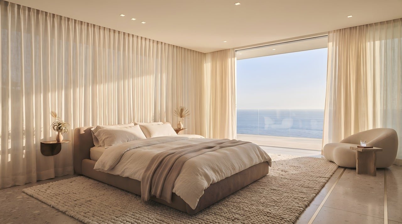
In 2019, researchers studying household environments found something quietly striking: women who described their homes as “cluttered” or “unfinished” showed measurably higher levels of cortisol, the body’s primary stress hormone, than those who described them as “restful” and “restorative.” The finding, published in the Journal of Environmental Psychology, put hard data behind what interior designers had long suspected. The space around you does not just look like something. It does something to you.
That insight sits at the heart of curated calm interior design, a phrase that has drifted through shelter magazines and design blogs for the better part of a decade. It isn’t a formal movement with a founding manifesto. It’s more of a working philosophy: the idea that a calm room is not an empty room, but a deliberately edited one. Every object earns its place. Nothing shouts. And the result is a space that feels composed rather than sparse.
What “Curated Calm” Actually Means
It helps to separate the two words. Curated implies intention and selection. A curator doesn’t simply fill a gallery wall; they choose, arrange, and sometimes remove. Calm, in design terms, refers to visual and sensory quiet: reduced contrast, softened edges, restrained color, and a sense of order that the eye can rest on.
Put them together and you get something distinct from minimalism. Pure minimalism, as an art movement, emerged in New York in the early 1960s and often pursued reduction for its own sake. Curated calm is warmer. It borrows from Scandinavian design and its emphasis on natural light and honest materials, from Japanese concepts like ma (the purposeful use of negative space) and wabi-sabi (beauty in imperfection), and from biophilic design, the framework popularized by Stephen Kellert and rooted in E.O. Wilson’s 1984 biophilia hypothesis, which argues humans have an innate affinity for living systems. (Minimalism)
The practical upshot: a curated-calm room usually contains fewer things than a maximalist one, but more texture, more natural material, and more deliberate imperfection than a strict minimalist one.
The Visual Grammar of a Calm Room
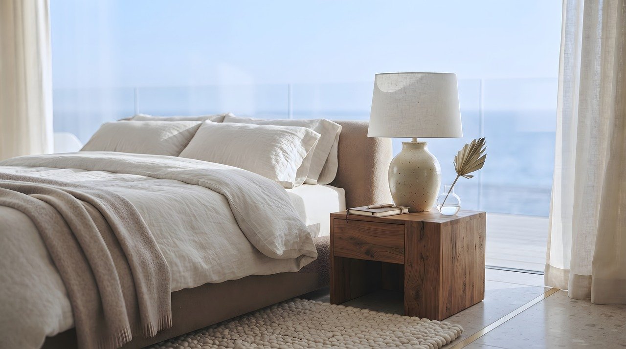
Designers who work in this vein tend to reach for the same handful of tools. Understanding them helps you apply the idea without copying a catalog page.
| Element | Calm Approach | Common Mistake |
|---|---|---|
| Color | Low-contrast, muted, tonal layers | Too many “quiet” colors that clash subtly |
| Texture | Natural fibers, matte finishes, visible grain | All-smooth surfaces that feel flat and cold |
| Light | Layered, warm, dimmable | One harsh overhead fixture doing all the work |
| Pattern | Small-scale, low-contrast, sparse | Bold pattern used as an accent “pop” |
| Objects | Few, meaningful, grouped | Open shelving crammed with small items |
The through-line is reduced visual noise. The eye is drawn to contrast and novelty, so a room full of competing focal points keeps the brain mildly alert. A calm room gives the eye one or two places to land and lets the rest recede.
Start With the Light
If there is a single lever that does the most work, it’s lighting. A room with one bright ceiling light produces flat illumination and hard shadows. A calm room layers light instead: a warm floor or table lamp, a dimmable overhead on a low setting, and daylight filtered through a sheer textile rather than blocked by a heavy blind.
Practitioners consistently report that swapping cool-white bulbs for warmer ones (around 2700K) is the cheapest change with the biggest perceived effect. It’s also the one people skip, because it’s invisible in photographs.
Choose a Tonal Palette, Not a Color Scheme
A calm palette is usually built from a narrow band of related tones rather than several distinct colors. Think oatmeal, clay, stone, and soft charcoal, layered so that the room reads as one continuous atmosphere.
The mistake here is subtle but common: people pick four “neutral” colors that are actually fighting each other, a warm beige next to a cool gray next to a yellow-cream. The result feels off without anyone being able to say why. The fix is to hold fabric and paint samples against each other in the actual room light before committing. This is the kind of detail that separates a considered space from an assembled one, much like the small decisions that define a great car’s interior, where design details that define a driver’s car hinge on the same principle of tonal harmony and material honesty.
The Editing Process: What Actually Works
Curated calm is less about buying and more about subtracting. Here’s a sequence that works in practice.
- Empty one surface completely. Clear a console, a shelf, a countertop. Live with it bare for a few days.
- Return only what you missed. This is the honest test. Most objects don’t survive it.
- Group in odd numbers, vary the heights. Three objects of differing scale read as intentional; five of the same size read as clutter.
- Remove one thing from every finished vignette. The final subtraction is usually the difference between “styled” and “calm.”
- Repeat quarterly. Calm decays. New purchases, gifts, and mail accumulate without anyone deciding to let them.
That fourth step is the one people resist. It feels wasteful or incomplete. In practice, it’s the single habit that keeps a room from drifting back toward visual noise.
Where Curated Calm Goes Wrong
The aesthetic has real failure modes, and they’re worth naming plainly.
The showroom problem. When every object is brand new, matching, and perfectly placed, the room reads as a hotel suite rather than a home. Calm needs some evidence of life: a worn linen throw, a stack of books actually being read, a plant with a stray leaf. The Japanese idea of wabi-sabi is useful here, because it treats imperfection as a feature rather than a flaw.
The cold-minimalist trap. Stripping a room down without adding warmth produces a space that photographs well and feels austere in person. Texture is the antidote. Wool, linen, raw wood, unglazed ceramic, and matte plaster all absorb light and soften a room’s acoustic character too.
The wellness-claim problem. It’s worth being skeptical of marketing that promises a curated interior will reduce anxiety or improve sleep. Some evidence links clutter to stress, but the effect sizes vary and the research is not settled. Many wellness-interior claims are promotional rather than scientific. A calm room is a reasonable thing to want; treat dramatic health promises with caution.
The one-and-done assumption. People often treat calm as a project with an endpoint. It behaves more like a garden. It needs periodic weeding.
A useful parallel comes from watchmaking and product design, where restraint in form is often what signals quality. The same logic applies to interiors: where design and innovation meet, the most confident choices are frequently the quietest ones.
Curated Calm Room by Room
The philosophy translates differently depending on the space.
Living rooms benefit from one strong anchor (a rug, a sofa, a piece of art) and everything else supporting it. Two competing anchors create tension.
Bedrooms respond best to the most aggressive editing. Remove screens, reduce surface clutter, and use blackout plus a warm low light for evening. The goal is a room whose only job is rest.
Kitchens are the hardest case, because function generates clutter by default. The workable approach is to designate one clear counter zone and treat everything else as storage. Open shelving is beautiful in photographs and a clutter magnet in daily life.
Home offices need a visual “landing strip” for the eye. A single framed print above the desk, a closed storage unit for papers, and a plant within view cover most of it.
For those thinking about how a home’s design language should reflect the people in it rather than a trend cycle, the principles behind designing a home that feels personal overlap heavily with curation: selection over accumulation.
Materials That Carry Calm
Certain materials do more of the work than others. A short list worth knowing:
- Linen and washed cotton for softness and a slightly irregular surface
- Unfinished or oiled wood for warmth and grain
- Lime plaster and matte paint for light diffusion without glare
- Wool and jute for acoustic softening and floor warmth
- Unglazed ceramic and stoneware for tactile contrast
Gloss and high-shine finishes are the usual culprits in rooms that feel restless. They reflect light sharply and create visual movement. Used sparingly, they add contrast; used broadly, they undermine the whole effect.
The Broader Shift Toward Intentional Interiors
Curated calm didn’t appear in a vacuum. It tracks a wider cultural move away from accumulation and toward intention, visible in fashion, in the slow-food movement, and in the way people now talk about buying fewer, better things. The design world has followed. Where the 2010s favored bold statement interiors built for social media, the current mood leans toward rooms that reward living in them rather than photographing them.
That shift connects to a longer conversation about the future of automotive design, where interiors are increasingly judged on how they feel over time rather than how they look in a single frame. Calm, it turns out, is a durability strategy.
A Realistic Starting Point
For anyone wanting to try this without a renovation budget, a weekend is enough to see whether the approach suits them. Clear one room’s surfaces. Change the bulbs to warm white. Remove half the decorative objects. Add one natural-textile item, a throw or a runner. Then live in the room for a week before buying anything else.
Most people find the effect is larger than expected, and that the urge to re-fill the space fades after a few days. That fading urge is the whole point. Curated calm isn’t a look you install; it’s a habit of noticing what a room is doing to you and adjusting accordingly.
Conclusion
Curated calm interior design has no rulebook and no trademark, which is both its weakness and its strength. It borrows credibly from Scandinavian restraint, Japanese spatial philosophy, and biophilic thinking, and it rests on a defensible idea: that visual noise carries a cost and that editing a space is a form of care. The evidence linking clutter to stress is real but incomplete, and the wellness marketing built on top of it deserves skepticism. What remains is practical and testable. Fewer things, chosen well. Softer light. Honest materials. One clear place for the eye to rest. Try it in a single room, subtract one more object than feels comfortable, and let the result make its own case.
Frequently Asked Questions
What is curated calm interior design?
It’s an approach to interiors that combines deliberate selection (curation) with visual and sensory quiet (calm). Rather than filling a room or stripping it bare, it favors a small number of meaningful, well-placed objects, a narrow tonal palette, layered warm lighting, and natural materials. It draws on Scandinavian design, Japanese concepts of negative space, and biophilic design, but it isn’t a formal movement with a fixed definition.
Is curated calm the same as minimalism?
No. Minimalism as an art movement, which emerged in the early 1960s, often pursued reduction for its own sake and could produce austere spaces. Curated calm is warmer and more forgiving. It tolerates texture, imperfection, and signs of daily life. The shared trait is restraint; the difference is that curated calm aims for comfort and atmosphere rather than pure formal reduction.
Does a calm interior actually reduce stress?
There’s some evidence that household clutter is associated with elevated cortisol, but the research is not settled and effect sizes vary across studies. Many wellness claims attached to interior design are marketing rather than science. A calm, orderly room is a reasonable thing to want and many people report it feels better, but dramatic health promises should be treated with caution. (Mental health)
How do I start without buying anything?
Clear one room’s surfaces completely and live with them bare for a few days. Return only the objects you genuinely missed. Then swap any cool-white bulbs for warmer ones and remove one item from each finished arrangement. These four steps cost nothing and produce most of the visible change. Wait a week before purchasing anything new.
Why does my calm room still feel cold or unwelcoming?
The usual cause is a lack of texture. Smooth, new, matching surfaces reflect light evenly and read as sterile. Add wool, linen, raw wood, unglazed ceramic, or matte plaster. A worn textile or a plant with visible life helps too. Calm needs warmth to avoid tipping into austerity, and texture is the most reliable way to supply it.
How often does a curated room need re-editing?
Practically, every few months. Calm decays as new purchases, gifts, and everyday objects accumulate without anyone deciding to let them in. A quarterly pass, clearing surfaces and removing one item from each grouping, keeps a room from drifting back toward visual noise. Think of it as maintenance rather than a one-time project.