
Are Touchscreens in Cars Safer Than Buttons? 2026 Evidence
 Abdul WadoodLast updated
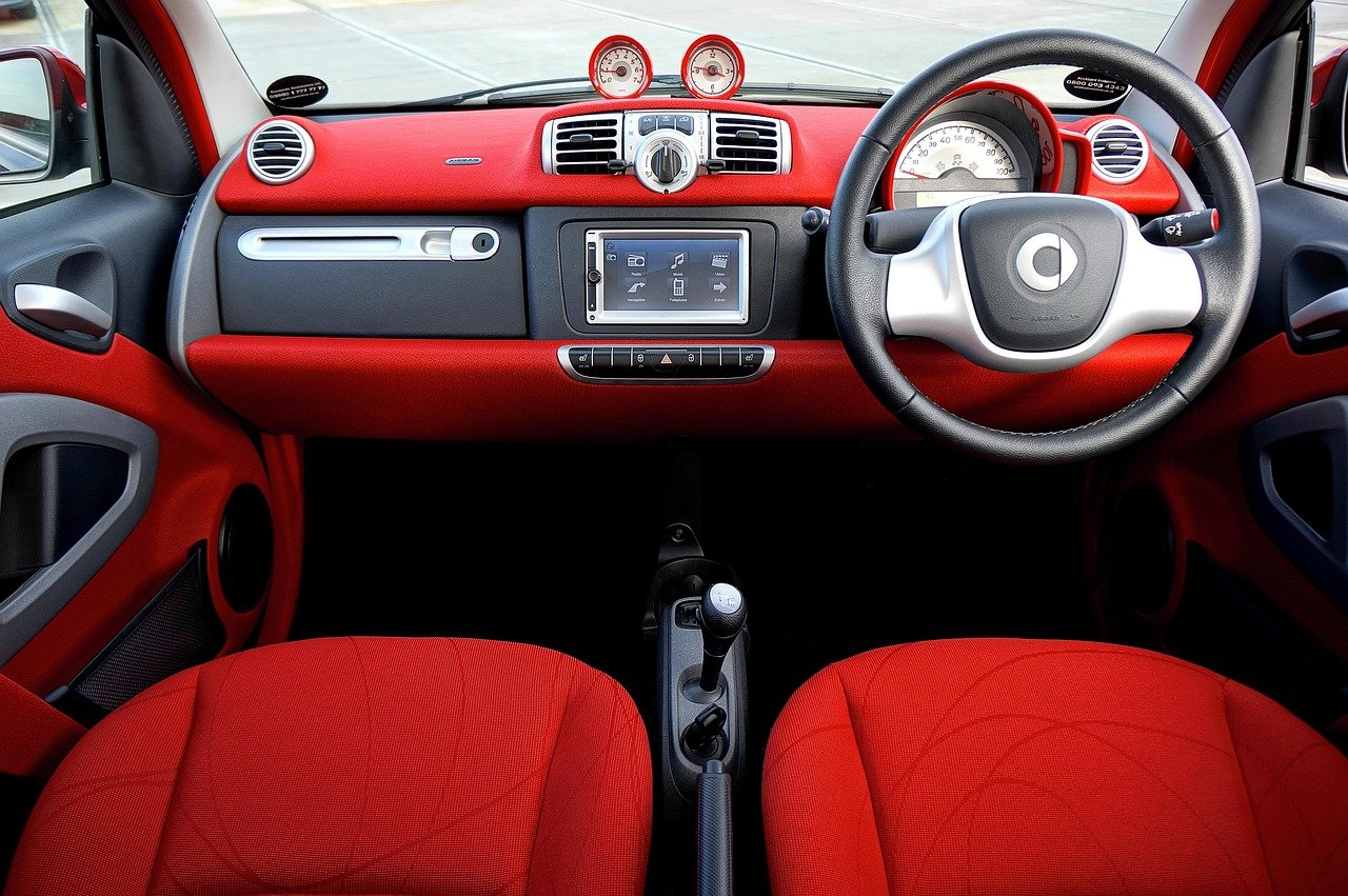
Quick Answer: Are touchscreens in cars safer than buttons?
It depends on the task, the driver, and the design. For simple, repeated actions like adjusting volume, wipers, or hazard lights, physical buttons usually win because they can be found by touch without looking away from the road. For complex jobs like navigation, searching, and map zooming, a well-designed touchscreen with voice control often beats a nest of small buttons. (Touchscreen)
The difference is rarely black and white. A good touchscreen with large targets, haptics, and reliable voice commands can close much of the gap, while a badly laid-out button cluster can be just as distracting as a menu buried three taps deep.
Before drawing conclusions, compare eyes-off-road time, target size, physical feedback, voice-command quality, menu depth, and how often you actually use each function while driving.
!cars
Every year, carmakers remove another row of knobs and replace it with a glowing slab of glass. It looks clean. It photographs well in showrooms. But the question of whether that trade is good for drivers has turned into one of the most heated arguments in the auto industry, and the answer is messier than either side admits.
Why the button-versus-screen debate exploded
For most of automotive history, controls were physical by default. Then Tesla put a giant portrait screen in the Model S, rivals copied the look, and interior design became a styling competition. By the early 2020s, some cars had moved even the headlight switch and turn signals onto glass.
The backlash arrived fast. Reviewers complained about hunting for defrosters. Safety researchers published eye-tracking studies. Regulators began asking whether “clean design” had quietly traded away usability. The conversation shifted from aesthetics to a blunt question: does a screen make driving more dangerous?
The short answer from the research is that how a control works matters more than whether it is glass or plastic. A physical button that is hidden behind a steering wheel is worse than a well-placed on-screen tile. Context beats category.
What the distraction research actually says
The strongest evidence comes from studies measuring eyes-off-road time and reaction speed while drivers complete realistic tasks. The pattern is consistent across several of them: tasks that require visual search take longer on touchscreens, especially when menus are nested.
A widely reported comparison measured how long drivers needed to complete simple functions at highway speed. Physical controls were consistently faster, and the gap widened as screens demanded more taps. The takeaway was not that screens are evil, but that time spent looking away is the metric that matters, and every extra tap adds to it.
There is an important caveat. Much of the research uses unfamiliar drivers in unfamiliar cars. Real owners learn where things are, and familiarity shrinks the gap considerably. Studies also disagree on magnitude: lab work tends to show bigger penalties than on-road testing, partly because lab tasks are often artificial.
The honest summary is that the evidence base is mixed but leans toward physical controls for simple, frequent actions. For complex tasks, the picture flips.
The strongest argument for buttons: muscle memory
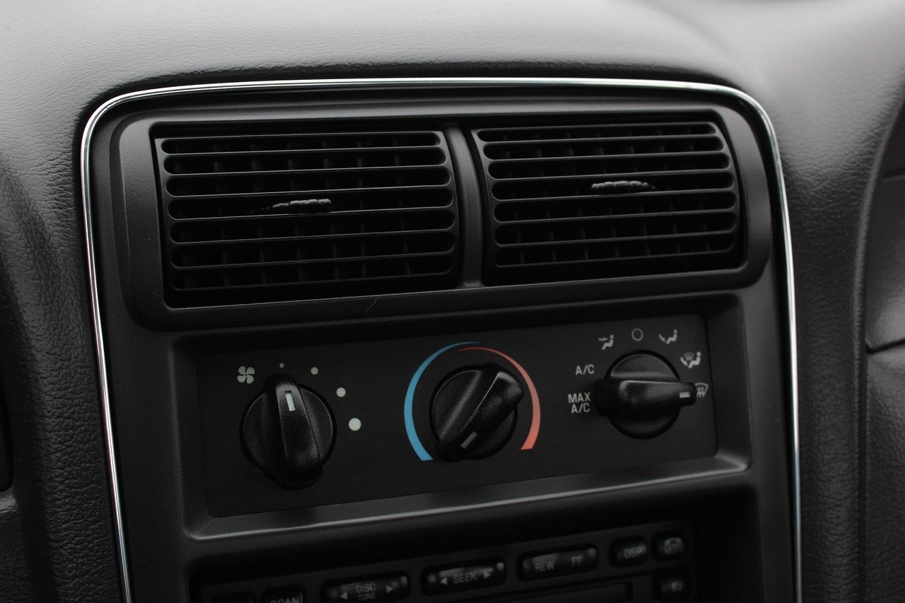
Physical controls offer something glass fundamentally cannot: proprioceptive feedback. Your fingers can find a rotary knob without your eyes leaving the road. You feel the click. You know it worked.
That matters more than most people realize. A driver at 70 mph covers roughly 100 feet every second. Two seconds of eyes-off-road time is a long, blind stretch of tarmac. A knob that takes half a second to find beats a menu that takes three. (Driver Assistance Technologies)
Buttons also fail gracefully. They do not lag, freeze, or demand a software update. In cold weather, gloves still work. In bright sun, they do not wash out. These are small things individually, but they add up to a control system you can trust without thinking.
The counterargument is equally fair: modern dashboards once had 50-plus buttons, and finding the right one was its own kind of search party. Consolidation is not automatically bad; it is only bad when it hides essentials.
Where touchscreens genuinely win
Screens are not a compromise. In several areas they are simply better.
- Navigation and maps. Zooming, panning, and searching for a charger or petrol station is far easier on a large display than through a joystick and a small screen.
- Flexibility. One panel can show climate, media, range, and camera feeds. Buttons cannot be reconfigured after purchase.
- Updates. Features can improve over time. A button is frozen at the moment of manufacture.
- Clarity for infrequent tasks. A labelled on-screen option is easier to understand than an unlabelled icon from 2009.
The industry’s own framing is that interiors are becoming software products. That argument has real merit, and it is why some manufacturers describe their cars as built around experience rather than hardware alone. You can see that philosophy explored in this piece on the cars built around experience.
The hybrid approach most engineers now prefer
The emerging consensus is neither pure screen nor pure button. It is a layered layout: physical controls for the functions you touch without looking, and a screen for everything that benefits from visuals.
| Function | Better control | Why |
|---|---|---|
| Volume and media skip | Physical knob or wheel button | Used constantly, no eyes needed |
| Hazard lights | Physical button | Emergency use, must be instant |
| Wipers and indicators | Physical stalk | Regulated in some markets, reflex action |
| Climate temperature | Physical dial preferred | Adjusted often, minimal attention |
| Navigation and search | Touchscreen plus voice | Visual task, benefits from a map |
| Vehicle settings | Touchscreen | Rarely changed, deep menus acceptable |
| Phone and messages | Voice first | Keeps eyes up |
This is roughly the layout safety bodies have pushed toward. The logic is simple: the more often a control is used and the less visual information it needs, the stronger the case for making it physical.
What regulators and safety bodies are pushing for
The most concrete signal came from Europe. The region’s independent crash-test programme announced that from 2026, cars would need physical controls for certain functions to earn top safety marks. The list focuses on essentials: indicators, hazard lights, horn, wipers, and the emergency call function.
Crucially, this is a ratings incentive, not a ban. Nothing in current law outlaws touchscreens, and the broader EU safety regulation focuses on systems like driver-distraction monitoring rather than control types. The pressure is coming from consumer ratings and public opinion, which carmakers ignore at their peril.
In the United States, the road safety agency has repeatedly said it is studying screen distraction but has not issued binding rules on control design. That leaves the market, and the ratings bodies, to shape behaviour. For a broader look at how technology is being reshaped around human limits, see technology with a more human touch.
Common mistakes drivers and buyers make
A few practical traps show up again and again.
- Assuming a big screen means a good interface. Size tells you nothing about menu depth. Sit in the car and try to change the fan speed while pretending to watch the road.
- Ignoring steering-wheel controls. The best interface is often the one your thumbs reach without leaving the wheel. Check what is duplicated there.
- Over-trusting voice control. Test it with an accent, with road noise, and with a passenger talking. Some systems are excellent; others are a shouting match.
- Buying for the showroom, not the commute. A screen that dazzles on a forecourt can frustrate on a rainy Tuesday.
- Skipping the manual. Many “hidden” functions have a physical shortcut nobody discovers.
If you are comparing models, treat the interior as seriously as the engine. Broader buying guidance lives in the Voozon cars section, and it is worth reading before you sign anything.
What actually works in practice
The most usable interiors share a handful of traits, and none of them require choosing a side.
Fixed physical controls for the safety-critical five. Indicators, hazards, horn, wipers, and lights should be reachable by reflex. No menus, no exceptions.
A persistent climate strip. Whether it is a row of buttons or a permanent on-screen bar, temperature and fan should never require leaving the current screen.
Large touch targets with haptics. If a control must live on glass, it should be big, spaced out, and give tactile confirmation. Small icons in a corner are a design failure.
Voice as a first-class path. “Set temperature to 21” should work every time, offline if possible.
Customisable shortcuts. A configurable button or two lets drivers put their own most-used function within reach.
Night dimming that actually works. A bright screen at 2 a.m. is its own distraction.
None of this is exotic. It is just the discipline of designing for a person who is, above all, driving.
Do drivers actually prefer buttons?
Mostly, yes, with nuance. Surveys and owner forums consistently show frustration with functions buried in menus, and physical knobs are frequently cited as a reason people like older or rival models. But the same drivers praise large maps, reversing cameras, and crisp media interfaces.
The pattern is not “screens bad.” It is “screens should not be the only option.” When a car offers both, complaints drop sharply. That is the strongest practical evidence in the whole debate: drivers do not want fewer screens, they want fewer reasons to look at them.
There is a design lesson here that goes beyond cars. Interfaces built around human attention tend to age well, whether they are in a cockpit or on a phone. A related example of how presentation choices shape perception shows up in unexpected places, such as this analysis of why ginger hair is rarer than you think.
How to judge a car’s controls in ten minutes
You do not need a lab. You need a routine.
- Sit in the driver’s seat with the engine off and the screen on.
- Without looking down, find the hazard lights. Then the rear defroster.
- Start a stopwatch. Change the cabin temperature by three degrees.
- Repeat, but navigate to a nearby charger or petrol station.
- Try the same tasks using only voice.
- Turn the brightness to maximum, then minimum, and imagine both at night.
- Ask whether a passenger could work the screen while you keep your eyes up.
If steps two and three feel clumsy, the interface will feel worse in traffic. First impressions of friction are usually accurate.
Conclusion
Touchscreens are not inherently safer or more dangerous than buttons. The evidence points to a narrower, more useful conclusion: physical controls are better for simple, frequent, safety-critical actions, and screens are better for complex, visual, infrequent ones. Cars that respect that split are easier and safer to live with than cars that pick a side out of ideology.
The regulatory wind is blowing toward hybrid layouts, and buyers are voting with their complaints. The next generation of interiors will almost certainly keep the big display and bring back a few knobs. That is not a retreat from technology. It is technology being fitted to the human at the wheel, which is where it should have started.
Frequently asked questions
Are touchscreens in cars actually illegal anywhere?
No major market bans them outright. Europe’s crash-test programme ties top ratings to physical controls for certain functions from 2026, and general vehicle rules require distraction monitoring, but a legal prohibition on touchscreens does not exist. The pressure is commercial and reputational rather than criminal.
Are physical buttons always safer than a touchscreen?
No. A poorly placed or unlabelled button can be as distracting as a bad menu. What matters is whether a control can be operated by feel, found quickly, and confirmed without a visual search. A well-designed screen with large targets and haptics can outperform a cramped, confusing button cluster.
Do voice controls make touchscreens safe?
They help a lot for tasks like calling, navigation entry, and climate changes, because they keep eyes up. But voice systems vary enormously in reliability, and background noise, accents, and complex requests still cause failures. Voice is a strong second channel, not a replacement for a physical hazard button.
Why are carmakers removing buttons if they are safer?
Cost, flexibility, and styling. A single screen replaces dozens of parts, can be updated after sale, and looks modern in a showroom. The trade-off is that usability depends entirely on software design, which is why some brands get it right and others generate headlines for the wrong reasons.
What should I check first when test-driving a car with a big screen?
Test the functions you use most: volume, temperature, wipers, and navigation. Do them without looking down, then time yourself. Check whether steering-wheel controls duplicate the essentials, and confirm the screen dims properly at night. Ten minutes of honest testing tells you more than any specification sheet.
Will cars bring buttons back?
Several manufacturers have already restored physical dials for climate and volume after customer feedback, and more are expected to follow as ratings pressure grows. The likely future is a hybrid: a large central display paired with a small, well-chosen set of physical controls for the things drivers touch without thinking.